Portfolio Website
Building my personal portfolio
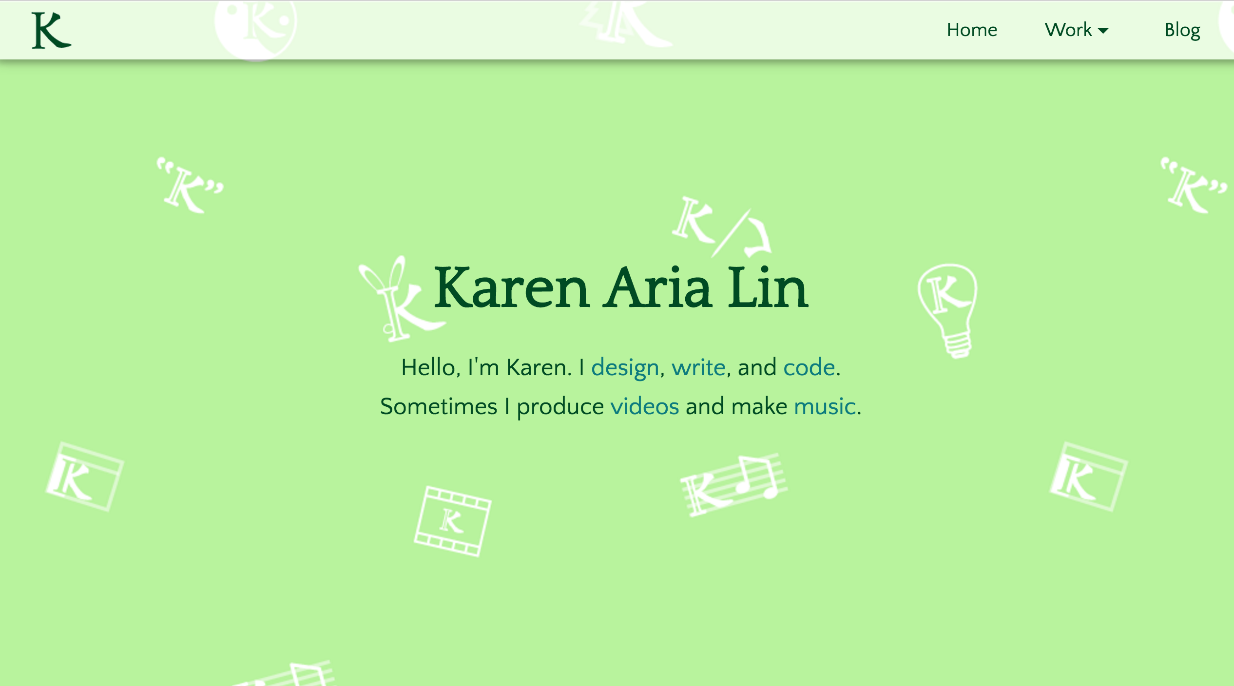
What a journey it was to build this website!
Tools used: Adobe Illustrator + Brackets + Google Fonts + Github Pages + Jekyll + CloudFlare + Namecheap + Google Analytics
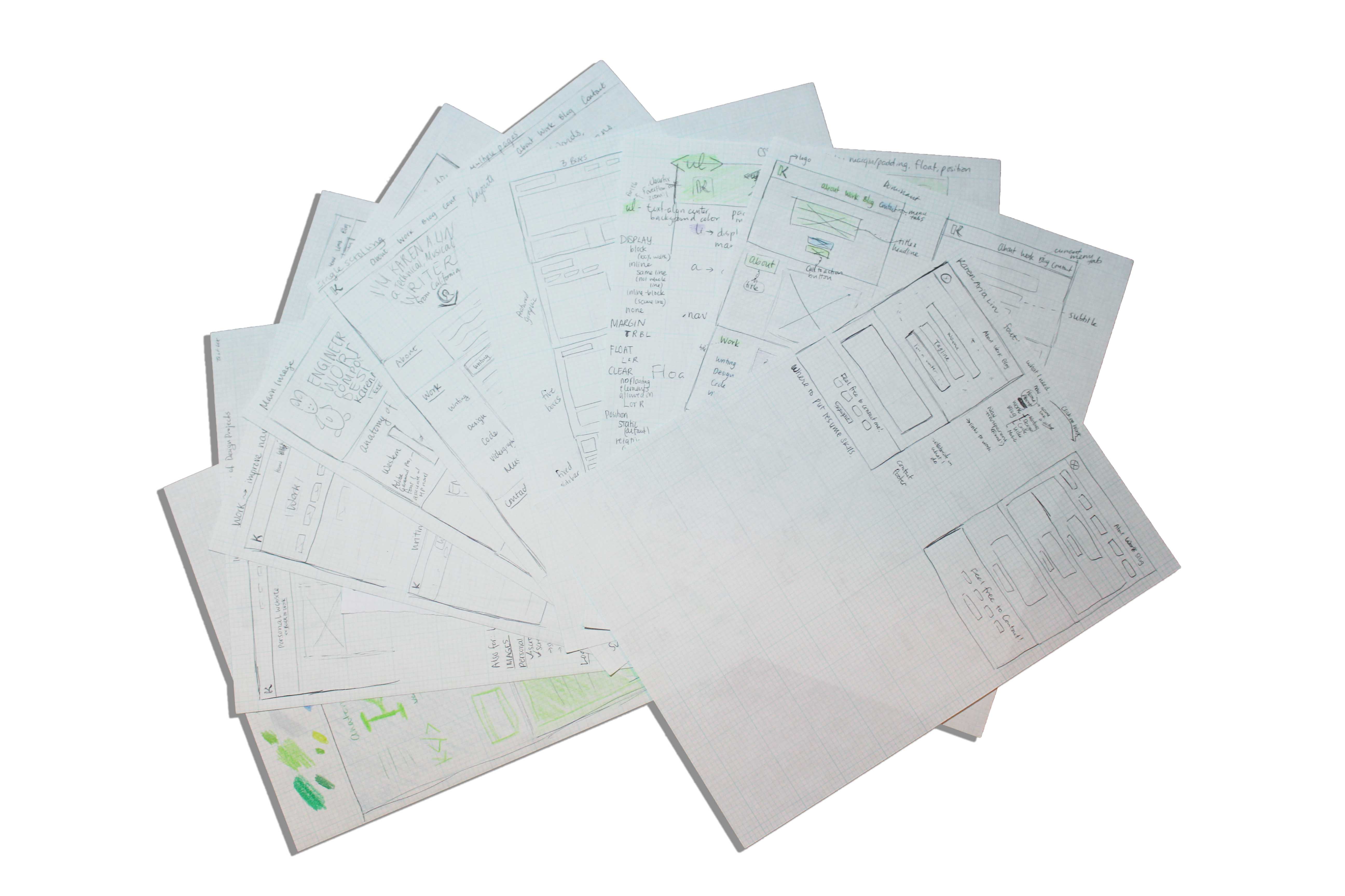
Wireframe sketches
Phase 1
DESIGN: I finalized my personal logo and sketched wireframes on pen and paper.
I debated between a multi-page and single-scroll layout before deciding on the multi-page format. I moved the pen-and-paper wireframes and logo designs on to Adobe Illustrator.
PROBLEMS: At first, I struggled along with coding in pure HTML/CSS/Javascript and Github Pages. I discovered that I was using lots of repetitive code in the headers and footers. The images were loading slowly. The design was lackluster and the colors clashed.
I was getting bad scores from Google PageSpeed Insights. The error messages were “leverage browser caching,” and “eliminate render-blocking JavaScript and CSS.”
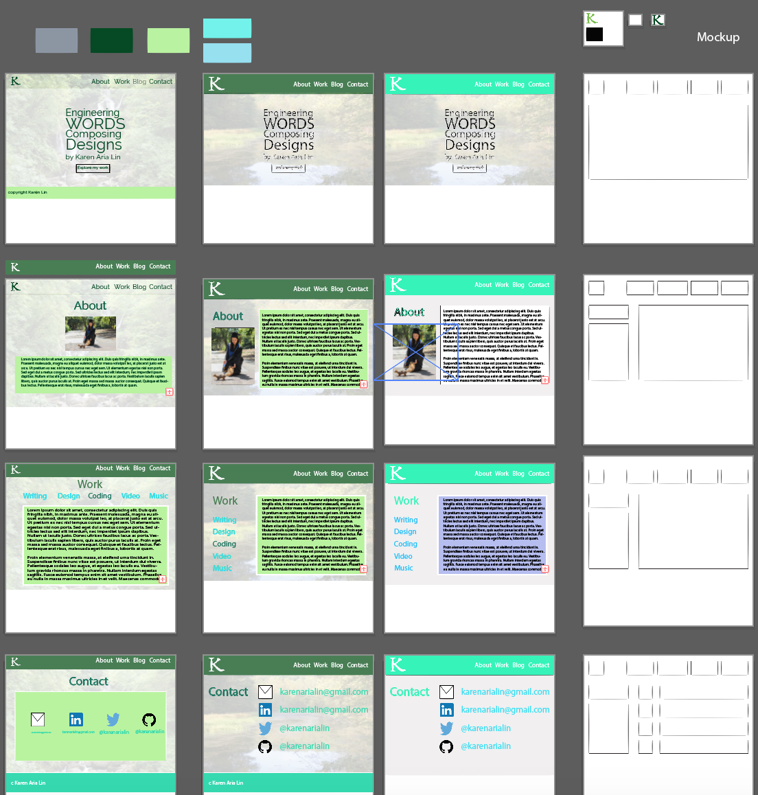
A section of my Adobe Illustrator canvas
Phase 2
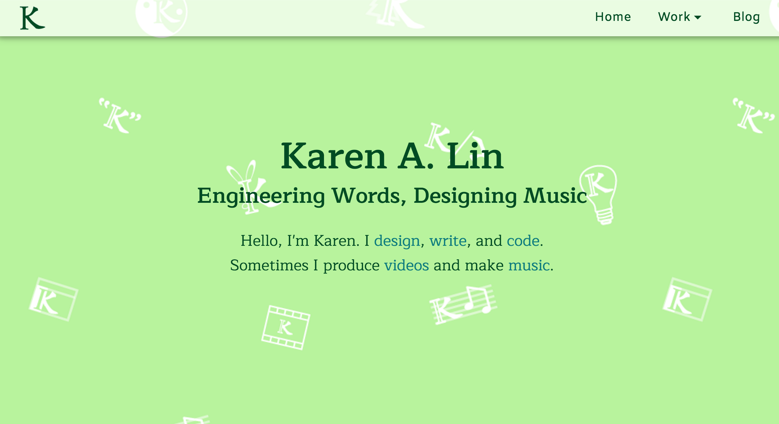
REDESIGN: I searched for ways to speed up the loading time and leverage caching. That’s when I discovered Jekyll, the static site generator that played nicely with Github Pages. I also found CloudFlare, a Content Delivery Network that promised speed and security.
I did more research and got feedback from friends before coming up with my current design. The old design is still in my backup branch because I can’t bear to kill old versions.
When I deployed the redesign, it felt like my site was reborn.
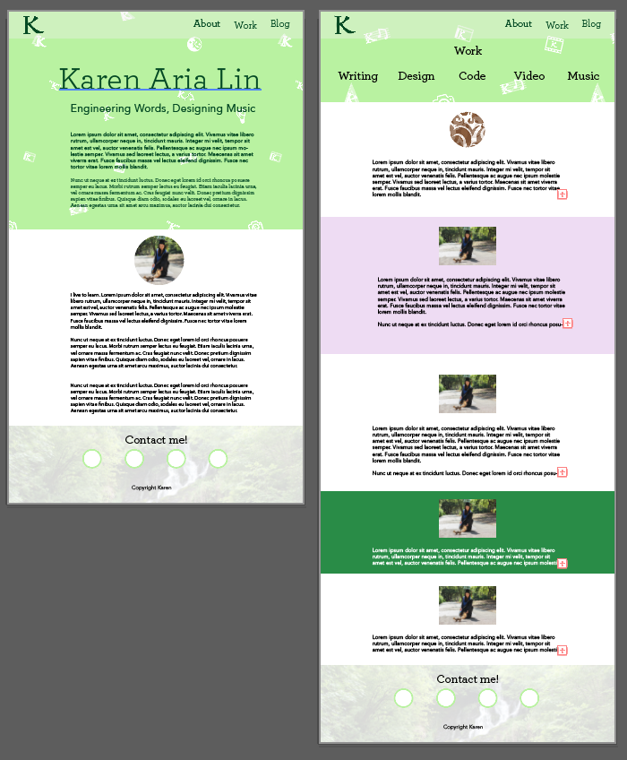
Back when I still enjoyed using the Archer font
Phase 3
FINISHING TOUCHES: The site still loaded my footer background picture slowly, so it was time to fix mobile responsiveness, add analytics, and leverage browser caching.
MOBILE RESPONSIVE REDESIGN: Got rid of left and right padding, used 75%-80% width for the div containers. The site still looks unattractive, but at least it works. Finished without making too many media queries. Unfortunately, things would have been much easier if I had started with a mobile-first approach. At least I know how to start the next website project.
PAGESPEED INSIGHTS: Optimizing images was easy, just saved pictures as gif files through Illustrator. Next…
Deferring JS loading was easy for script.js, but complicated for JQuery. But then I searched up other websites, and many of them don’t have 100% on PageSpeed Insights. Even google.com doesn’t have 100%.
So I moved on to Cloudflare. Hopefully that would solve my cache leveraging and security problems. But it turns out I need a custom domain.
CUSTOM DOMAIN: I thought karenarialin.me had a nice ring to it, so I bought it on Namecheap. Followed instructions here to redirect karenarialin.github.io to karenarialin.me.
Now I could add the website to my Cloudflare plan. As I waited for it to take effect, I redesigned my blog to flow better with the website.
ANALYTICS: Last step! I signed up for Google Analytics and got it working.
Time to deploy and share with the world!
Phase 4
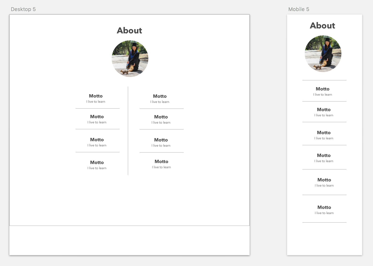
FINE-TUNING: As I continued to receive feedback, some people told me that the site looked a bit plain. Indeed, the linear structure of the information made even my own eyes glaze over.
I started with a redesign of the About page. This time, I drew my wireframes in Sketch.
Conclusions
Changes are still ongoing. I’m collecting feedback and researching like crazy to make the website better. Stay tuned!